Refined, User-Focused shopping with an educational twist.
*Mock Project*
Museum Shop Mockups: Apparel landing page (left), Museum Shop Homepage (center), Store Information Page (right).
The Project:
For this mock project, my goal was to re-design the Art Institute of Chicago’s Museum Shop website to create a better focus on connecting Members and Visitors to their most desired products and to the inspiration and education the AIC strives to achieve with all user experiences.
My Role:
UX Designer (Individual Mock Project)
UX Researcher
Tools:
InVision (Prototype)
Sketch (Wireframes and Mockups)
Pen and Paper (Storyboarding)
The Solution:
For Members I created an accessible and enjoyable repeat experience by highlighting Gift Giving in the main menu, One-Of-A-Kind gifts, and Current Exhibit items. I also added a Favorites section (which is featured on the Account page) for quick access to items in the future. This feature encourages repeat visits and adds another level of convenience for the user.
For Visitors I created an efficient, but still welcoming first time experience. To accomplish this I added quick access to AIC themed items, Current Exhibit Items, and Items Under $50. I also created a Gift Box category, allowing users to easily be able to purchase a small collection of similar items.
For both Members and Visitors I added a few features that gave them the option to both learn and connect more with AIC, through a Fun Facts feature, specific ARTifacts blog links on product pages, and highlighting links to social media, especially Instagram.
I spent significant time redesigning the homepage (pictured below) so users would be able to easily navigate to and find their desired products.
Research:
To start my research journey, I took a trip to the Art Institute and explored around, visiting both gift shops, taking pictures, and observing visitors. After interviewing several people (including employees) at the museum store, I conducted 3 phone interviews with regular museum visitors to get a better sense of spending habits, what kinds of products they are looking for, and how often they visit.
I also spent time analyzing other museum online stores, including The Met, the MCA, and looking at other ecommerce sites selling similar items, such as Colossal.
For the online store, I spent time using the site and detailing out what I felt was working and what was not. These details came into focus especially as I started to create insights from the user interviews.
“I love seeing products from the exhibit I just visited!”
Analyzing & Synthesizing Research:
I started to sort through my findings and created an affinity map, which helped me group similar pieces of information. After deliberating, re-examining the data and re-arranging facts, I created the following insights.
Lack of easy access to:
AIC Themed Items
Exhibit Themed Items
Social Media Links
No Ability to:
Favorite/Save Items
Connect and learn more about Items

Working through the data.
Users , Stories & Flows:
From my research I was able to determine two distinct users; Members (frequent visitors) and Visitors (infrequent users, often tourists). Members are likely to have an account on the website and enjoy exploring around the website, while Visitors want a quick and effective experience. I created storyboards and then user flows as I determined what the different users experiences and interactions would be, both at the museum and on the website.
Storyboard for a Member as she looks for a One-Of-A-Kind gift on the Museum Shop website.
That storyboard turned into a User Flow.
Design Principles:
How might we make the website a more accessible and enjoyable experience for repeat customers (especially Members) as they are shopping for specific gifts and specialty items only found at the Museum Shop?
How might we further the education and inspiration for users while they are shopping on the website?
How might the website be changed so there is quicker access to the key features Visitors are looking for (AIC Items, Current Exhibits, Under $50) so users will pleased and excited by their unique purchases?
I started to sketch out ideas to reach a solution. This included wireframes, additional user scenarios, and mind maps (especially as I tried to organize menu categories).
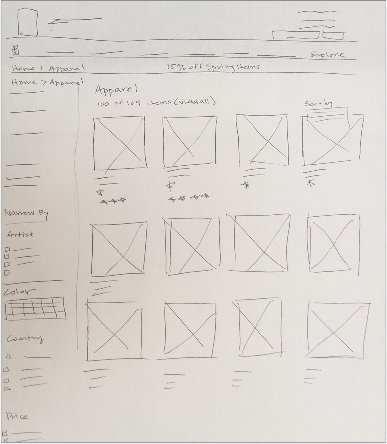
Initial Wireframe Sketching
Continued Wireframe Sketching
Design Solutions:
For Visitors:
Efficient, but welcoming and easy first time experience
Quick access to AIC Items, Current Exhibit Items, Items Under $50
Quick Checkout, no pressure to sign up
Still Maintaining Educational and Inspiring connections
For Members:
Accessible and Enjoyable repeat experience
Highlight Gift Giving, One-Of-A-Kind, Current Exhibits
Encourage growth and connection through Blog and Instagram
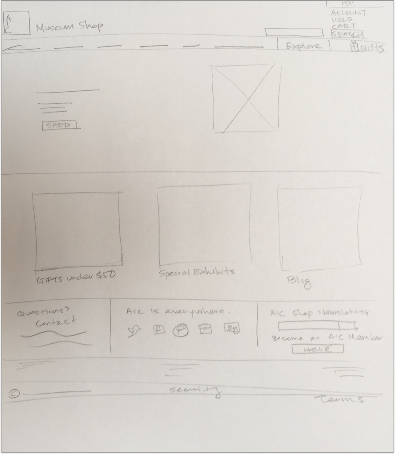
Homepage Revisions:
The first big task was to revise the homepage. While there were style choices and features I liked, a lot of the content was getting lost in the multiple menus, an array of photos, and a messy footer. By adding an Explore the Shop option in the main menu I was able to hide a lot of the lower menu options (especially those that users didn't need immediate access to). I filled the space with a trio of featured categories, and cleaned up the footer, giving priority to the newsletter sign up, social media links, and the ARTifacts blog. The images below also show the iteration process as I explored layout, what to feature where, and what would be visible above the fold.
Re-Design Process: Cleaning up the homepage and featuring AIC Membership, featured gift categories and links to the AIC blog and social media accounts.
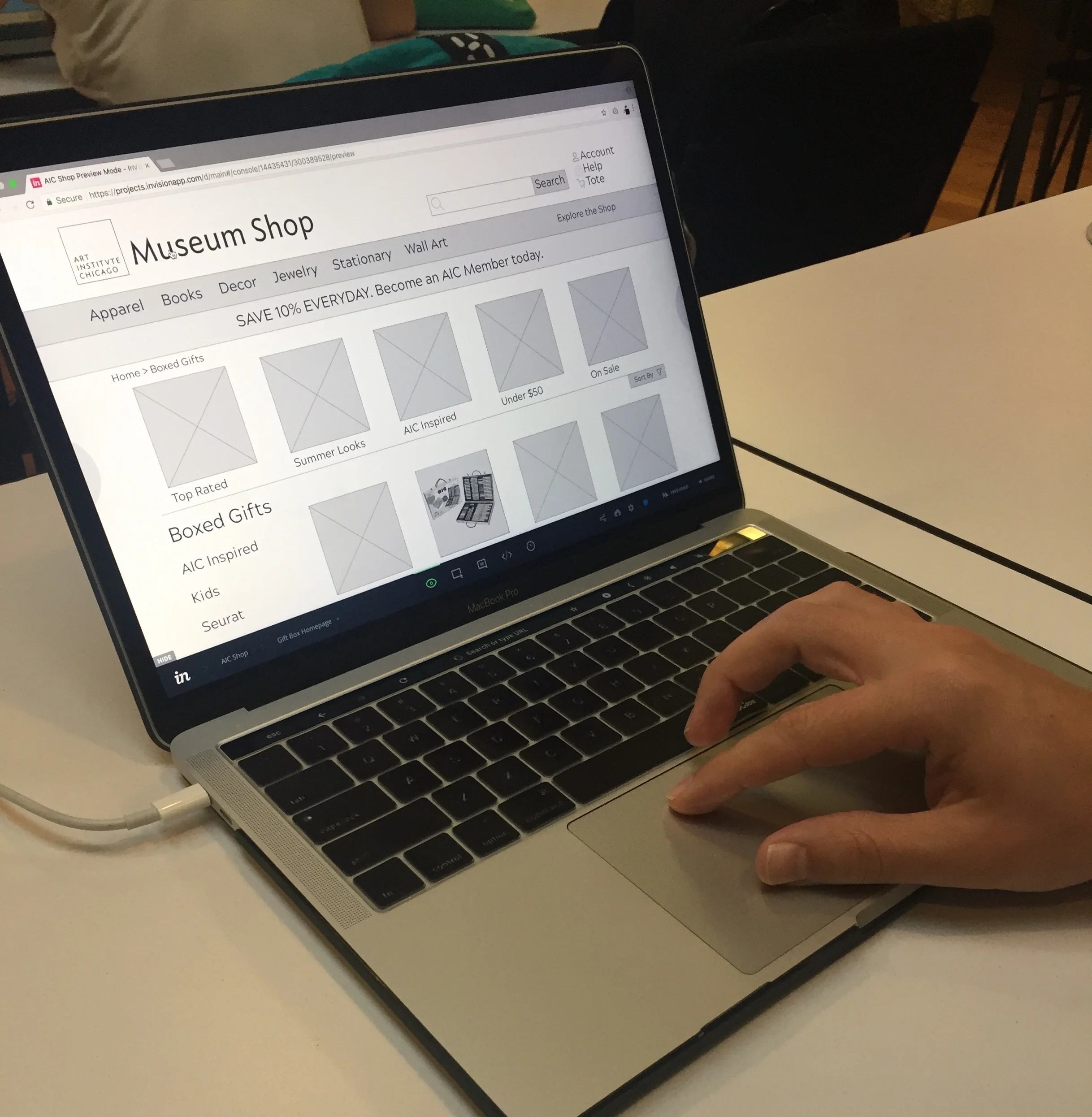
Clickable Prototype:
After building medium fidelity wireframes in Sketch, I created a prototype with InVision for usability testing. This flow follows a user purchasing a scarf that has been saved in the favorites section of the account page.
Usability Testing:
Conducting usability tests in the classroom.
I conducted 3 usability tests. The results indicated that it was confusing whether or not an item had been added to the cart after clicking the “add to cart” button, so I created a pop-up that showed the carts contents, total, and a link to edit the cart.
Fresh Perspectives:
I was still trying to think of some creative ways to implement my goal of creating the shopping experience both educational and inspirational. I decided to engage in the Crazy Eights exercise in order to iterate on some of the themes and ideas I was playing with. This resulted in some fresh perspectives and led to the implementation of three key features:
A Link to ARTifacts Blog on Individual Product Pages for items that have a relatable blog post
A Fun Fact Feature, highlighted with an icon, that gives the user an insight about the product they are viewing
Featuring the Favorite/Saved items on the account homepage
The revised product info section allows user to quickly read an interesting fact about the item they are viewing through the FUN FACT feature, and to explore and learn further by clicking the ARTifact button, creating a greater connection between the user, the products, and the AIC.
Link from a product page to the ARTifacts Blog Page it relates to.
Mockups:
With my new ideas ready to go, I pushed forward and completed my wireframes in Sketch, finalizing design decisions, adding color, and polishing everything up.
Mockups: Museum Shop Homepage (left), Apparel landing page (center), and a Individual Apparel Item page (right).
Mockups: Sign In/New Account page (left), Final section of the Checkout page (center), and the Store Infomation page (right).
Conclusion:
The website was well-received with the initial users. My goals were to refine the shopping experience by connecting users to the products they were looking for, and to continue to educate and inspire the users while they shopped, and the website is well on its way to achieving those goals.
Were I to move forward, I would continue to conduct usability testing, and also do user testing on the current AIC shop website. I would also start looking more into competitive analysis, and continue to look into different ways to educate the users while they shop.
As a result of this experience I learned about the importance of continuing to brainstorm and be open to new ideas, even as the project is nearing completion.